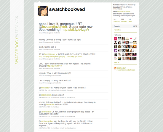
My addiction to updating my logo has led me to this new look & feel for Swatchbook Weddings. I finally feel like this could be it! Here it is on my
twitter page:
and here's a little more info about my journey to this look...
Logo #1: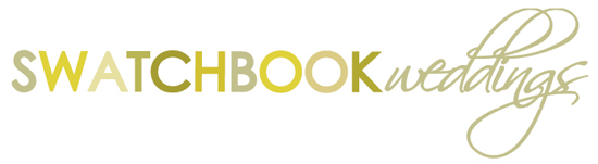
Before I realized my hatred for Scriptina, I really loved this. But the sweeping script font made it very difficult to resize & was often hard to read. I was trying to pay homage to my favorite mustard yellow color but found it can be a hit or miss on the web.
Logo #2:
I still love both of these fonts & I think they suit my brand very well, but when designing the other pieces of my collateral (business cards, website, etc...) where the logo would not be standing alone, the mixed fonts were just becoming too busy. It was hard to create hierarchy in the text without adding ANOTHER font and it was just too much.
Logo #3:
Structured & simple, this logo allows me to use the handwritten font as the secondary level of information. This is so important when organizing text and creating a system in your design, and this organization makes me happy :) It's like keeping the peace in your design - nothing is fighting for attention, everyone has their role. Now that I've seen this grey out on the interwebs, I realize I may need to darken it, but so far I am liking the look!